Perficient Partners - 5 user problems. One app that actually solves them
Role
Duration
Team
Platform
Key Metric 1
Core user problems solved in one app
Key Metric 2
User personas validated through research
Key Metric 3
Claim assistance - from weeks of confusion to step-by-step guidance
Summary
Overview
Insurance apps fail users in a predictable way - they're built around the insurer's internal logic, not the person filing the claim. Perficient Partners wanted to fix that. I designed a mobile app from the ground up that combines claim tracking, medical service integration, AI-powered guidance, and personalized support into one coherent experience. The goal was to make insurance feel less like a bureaucratic wall and more like something a person could actually navigate on their own.
Insurance is complicated by design - this app was designed to undo that.

Problem Framing
The Core Problem
Users were hitting the same five walls every time they interacted with their insurance: confusing jargon, no guidance through claims, medical and insurance services living in completely separate places, no personalization, and no access to expert help when something went wrong. Every one of those problems was a separate drop-off point. Together, they made the whole experience feel unmanageable.
Why it mattered
For Perficient Partners, the business case was direct — every user who gives up mid-claim or mis-files because they didn't understand the process is a cost, not just a UX problem. Confused users call support more, churn faster, and trust the platform less. An app that actually guides people through the process is both a retention tool and a support cost reducer.
Supporting data / evidence
Primary research included in-depth user interviews, surveys measuring experience and preferences, and usability testing on existing insurance apps. Secondary research covered market analysis of competitor platforms, insurance technology industry reports, and academic papers on UX in financial services. Three distinct user personas emerged - a software engineer who found the jargon impenetrable, a nurse dealing with fragmented medical-insurance handoffs, and a small business owner locked out of expert guidance. Each represented a real, recurring failure mode in the existing experience.
Role & Team
My Role
I led the full design process - user research, persona development, user flow mapping, wireframes, design system, and all high-fidelity UI screens. I also defined the AI module interaction pattern and the claim tracking flow, which were the two highest-stakes parts of the experience.
Team Composition
Solo designer. Perficient Partners provided the product brief, business context, and access to user feedback throughout the process.
Stakeholders & decision-makers
Perficient Partners' product leadership. Key design decisions - particularly around the AI assistance module and claim flow - were reviewed directly with the client before moving to high-fidelity.
Approach
Strategy & framework
The design strategy was integration before interface. The reason most insurance apps feel broken isn't the visual design - it's that the underlying services don't talk to each other, so the UI can't hide the seams. My approach was to map the full user journey across all five problem areas first, identify where the handoffs between services created friction, and design those transition moments before anything else. Once the flow held up, the UI followed naturally.
Research methods used
User interviews with current and potential insurance users. Quantitative surveys on user experience and preferences. Usability testing on three competing insurance apps. Competitive market analysis. Industry and academic research on insurance technology and UX behavior. Persona development across three distinct user types - tech-literate individual user, healthcare professional, and small business owner.
Key insight(s)
Users don't want to understand insurance better. They want to stop thinking about it. The design direction shifted the moment I reframed the goal from "educating users about their coverage" to "removing every moment where a user has to make a decision they're not equipped to make." The AI module wasn't a feature - it became the core of the experience.
Challenges
Primary challenge
Designing an AI assistance layer that felt genuinely helpful without feeling like a chatbot dead-end. Most in-app AI interactions in insurance are either too generic to be useful or so narrowly scripted that users hit a wall immediately. The challenge was making the AI module feel like it was actually responding to the user's situation - not running through a decision tree.
How I navigated it
I designed the AI module around pre-defined inquiry patterns - common claim questions, coverage checks, and service requests that users actually initiate - rather than open-ended chat. This gave the module a clear scope it could reliably handle, with escalation paths to human expert access built in for anything outside that scope. The one-tap query design kept the interaction fast and low-commitment, which increased the chance users would actually use it.
What I Did differently
I'd push harder on the onboarding flow during wireframing. The app asks users to connect their medical and insurance information early, which is a significant trust moment - and the current design moves through it faster than it probably should. A longer, more transparent onboarding that explains exactly what's being connected and why would reduce early drop-off and build the trust the rest of the app depends on.
Solution
What I designed
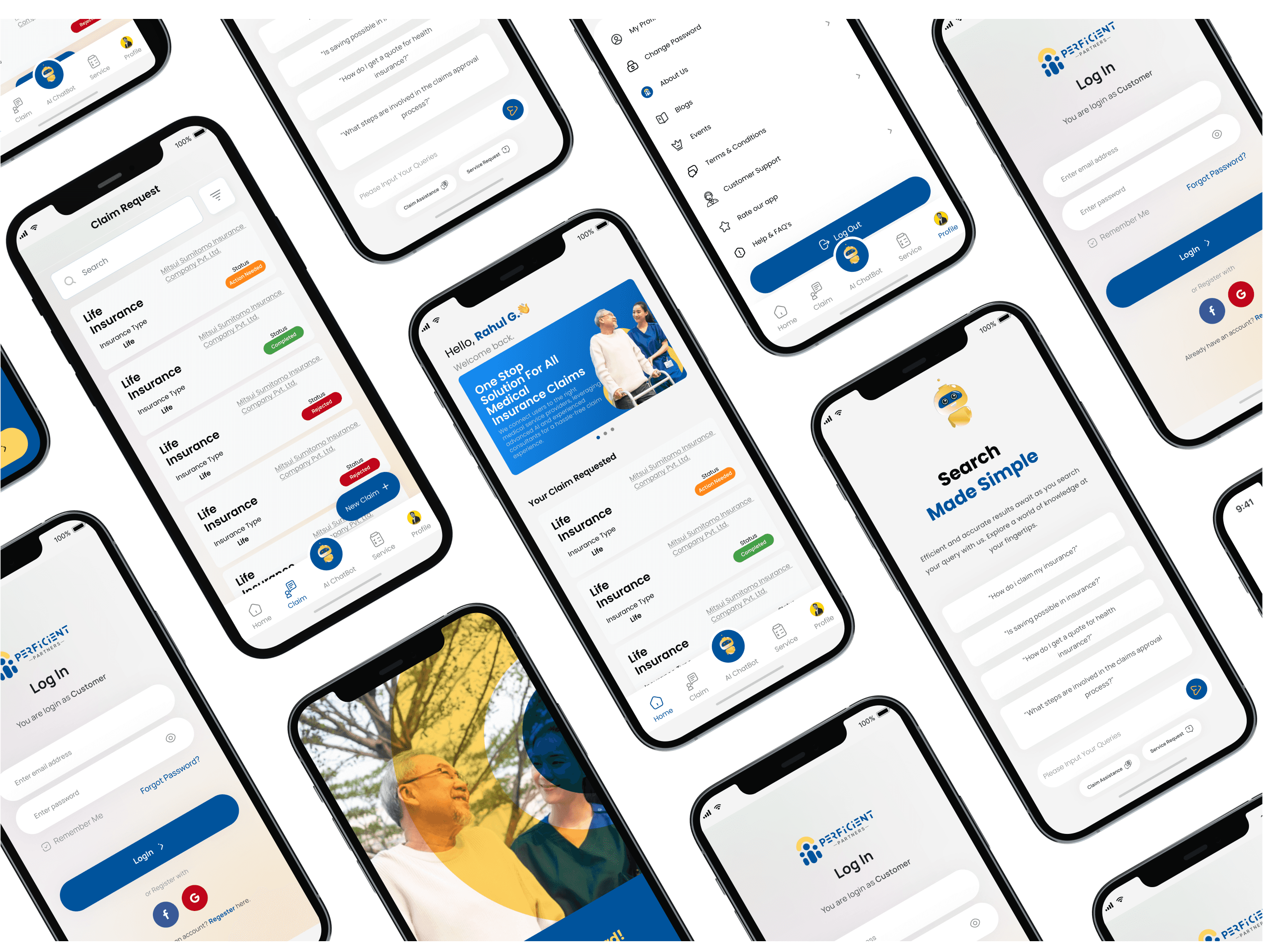
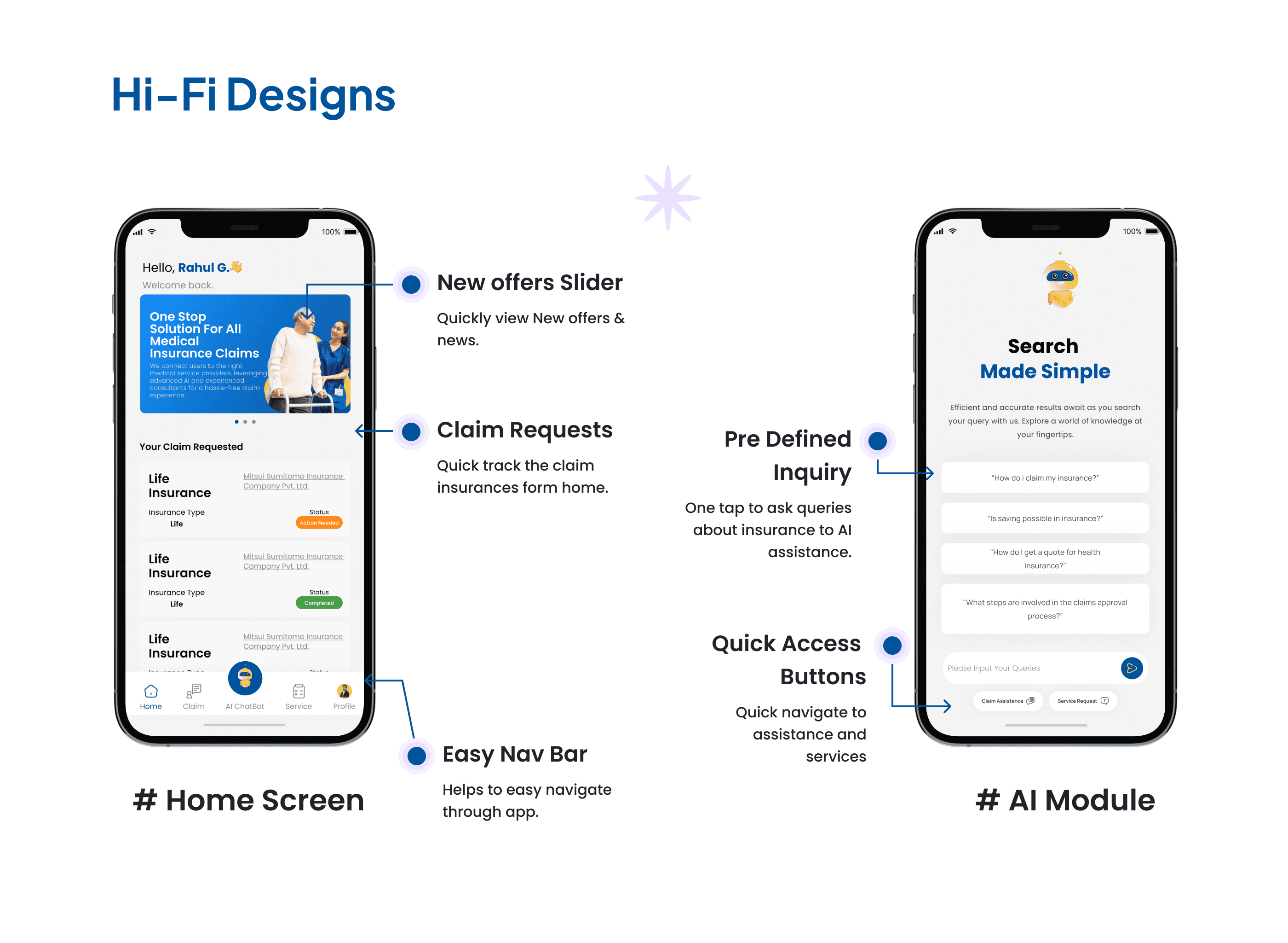
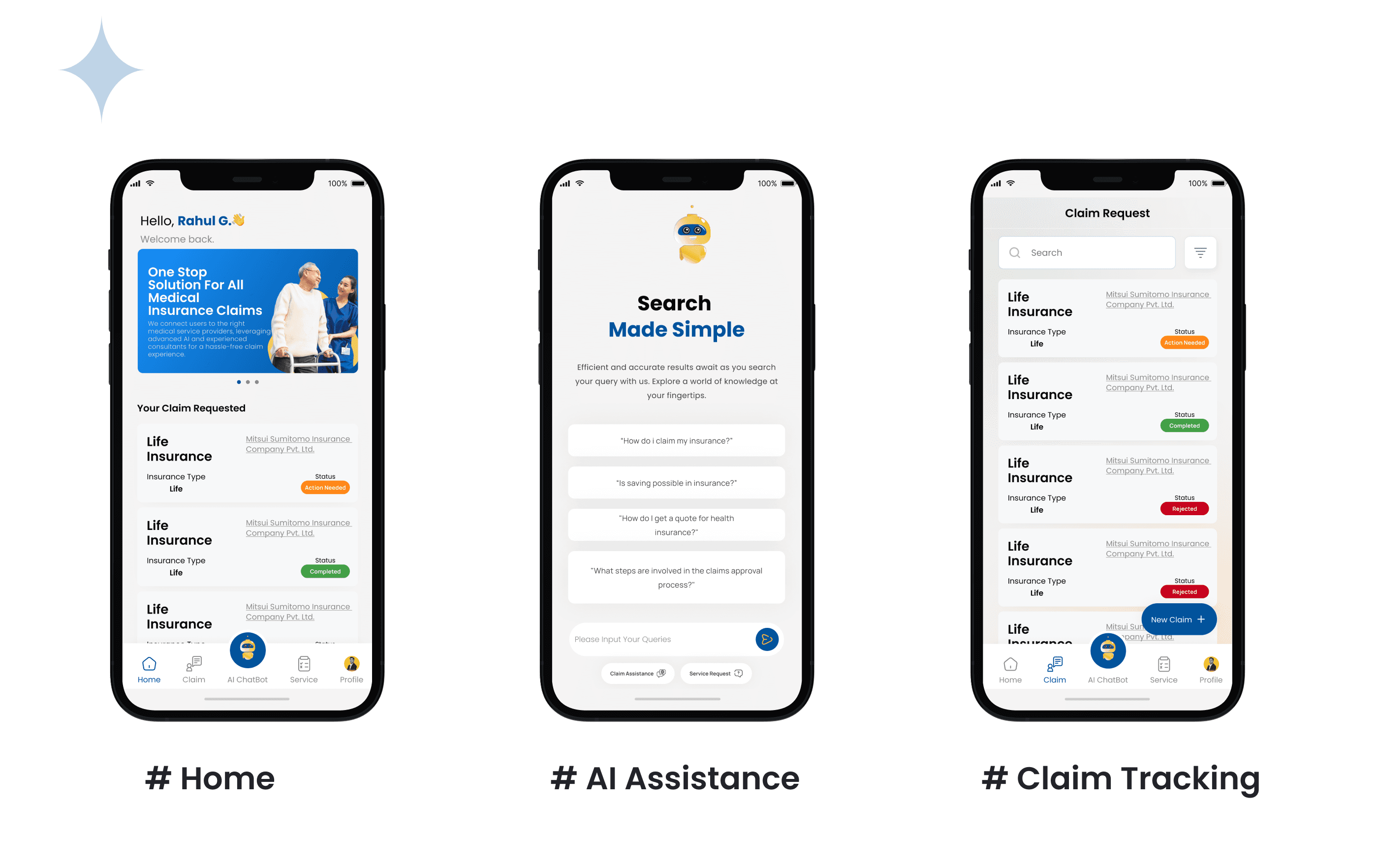
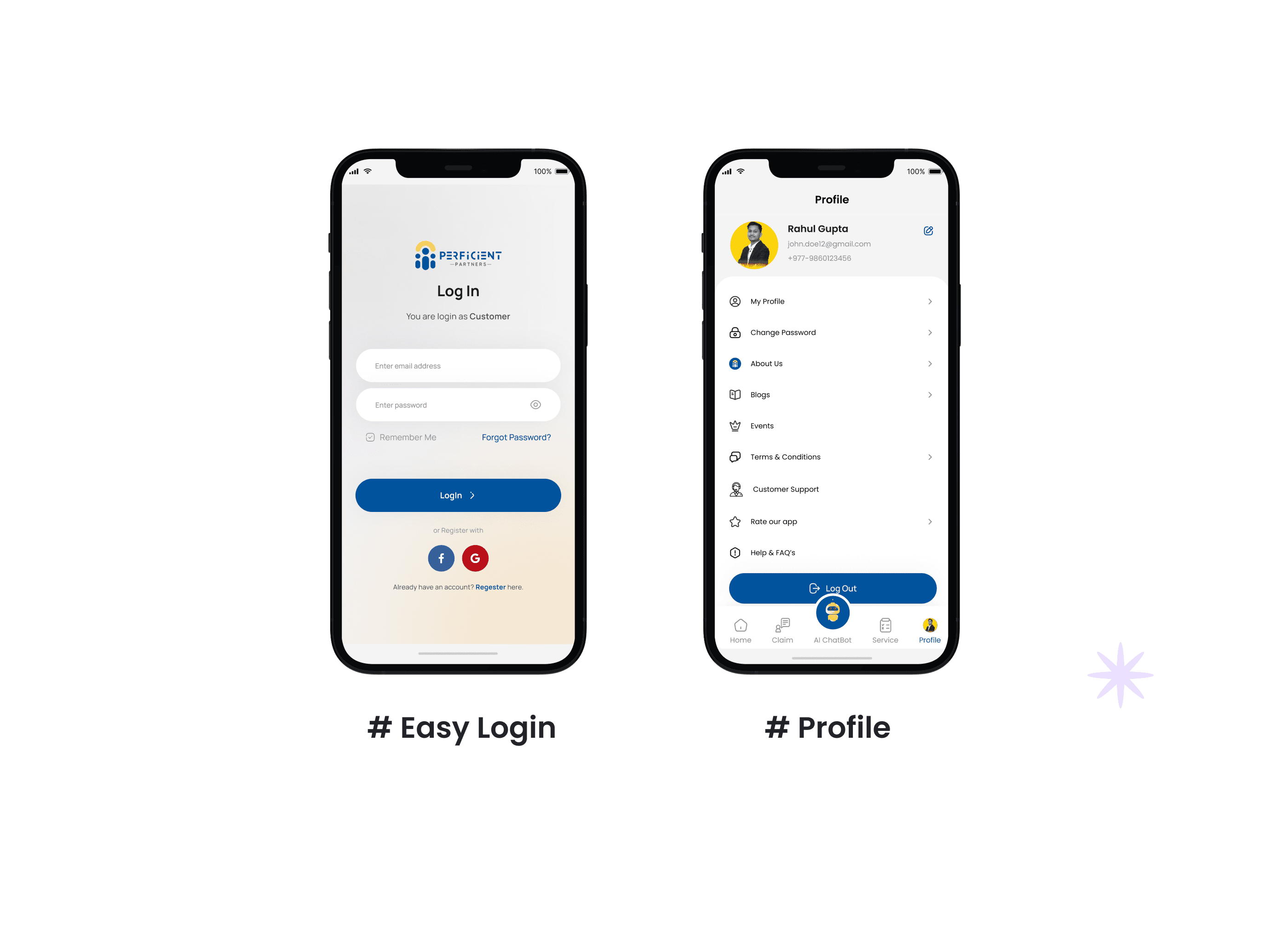
A five-module mobile app - Home dashboard, AI Assistance, Claim Tracking, Profile, and a content section for health and wellness guidance. Each module has a distinct job, but they're connected through a shared navigation system and a consistent visual language that keeps the experience feeling like one product, not five stitched-together tools.
Key design decisions
1. One-tap AI query entry. Rather than burying the AI assistance behind a chat icon, I surfaced pre-defined inquiry shortcuts directly on the home screen. Users can ask the most common insurance questions without typing a single word - which is the right call for an audience that already finds the topic stressful. 2. Claim tracking from the home screen. Claim status was treated as primary content, not a buried menu item. Users who have an active claim check it constantly. Surfacing it immediately on the dashboard removed the biggest navigation pain point identified in usability testing of competing apps. 3. Service integration as the structural core. Medical services and insurance claims were mapped onto the same user flow rather than kept in separate sections. A user filing a claim that involves a medical event can access both sides of that process from the same screen - no switching, no re-entering context.

Results & Impact
Quantitative results
Five core user problems - complex processes, disjointed services, inefficient claims, lack of personalization, and limited expert access - addressed within a single app with five distinct but connected modules. Three validated user personas covered across the full feature set.
Qualitative outcomes
Research and testing confirmed that users responded strongly to two specific design decisions: the one-tap AI query entry (described as "actually useful, not just a chatbot") and the home-screen claim tracking (users stopped looking for it immediately). The persona work also validated that the same core interface could serve meaningfully different users - the nurse, the engineer, and the business owner - without the app feeling generic.
Business impact
Perficient Partners now has a product that directly addresses the two biggest drivers of user churn in insurance apps - confusion during claims and fragmented service access. The AI module reduces dependency on human support for common queries. The integrated medical-insurance flow positions Perficient differently from standard insurance apps, which is a genuine product differentiator in a crowded market.
Next Steps
What's next (and why)
The AI module is built around pre-defined queries for now - the logical next phase is expanding its coverage using real usage data post-launch. The queries users actually type (outside the pre-defined set) are a direct signal of what the app isn't handling yet, and that data should drive the next development sprint.
Open questions / hypotheses
Does the one-tap query design hold up for users who have non-standard claims - situations outside the pre-defined inquiry set? And how does the medical-insurance integration perform when users are managing an active, time-sensitive claim where speed matters more than guidance?
Learnings
The biggest thing this project reinforced: AI features are only as good as the problem framing behind them. The AI module works because it was designed around specific, recurring user failures - not because it's technically capable of answering anything. Scope is a design decision. In a high-anxiety context like insurance, a focused tool that reliably handles ten things beats a flexible tool that unpredictably handles a hundred.